
Finding an entrance, parking area, elevator, office, restroom, or exit should never feel complicated. A well-planned wayfinding sign helps people understand where they are, where they need to go, and what step comes next.
For businesses and properties in Miami, FL, clear visual guidance can improve the visitor experience before a customer ever speaks with an employee. From business parks to Downtown Miami towers, hotels, healthcare facilities, residential communities, retail environments, and event venues, the right visual system can reduce confusion while creating a more professional first impression.
This guide explains how wayfinding works, which sign formats are useful, how materials and placement affect performance, and why custom wayfinding signs in Miami should be planned as part of the overall customer experience rather than as isolated pieces installed one at a time.
Article outline: The guide covers visual navigation and visitor flow, the purpose of each sign, route planning, visual identity, materials, indoor and exterior applications, accessibility, placement, industry-specific use cases, and the process for building a coordinated system.
What Is Wayfinding and Why Does It Matter?
Wayfinding is the process of helping people move through a physical environment using signs, visual cues, maps, landmarks, color, typography, and consistent destination names. It becomes especially important when visitors enter a property for the first time or when a site includes several buildings, floors, entrances, parking areas, or departments.
A strong system anticipates questions before visitors need to ask them. Where should I park? Which entrance should I use? Is reception on this floor? Which corridor leads to Suite 210? When those answers appear at the right moment, people move with greater confidence and the property feels easier to understand.
This can also reduce repetitive questions for employees. Instead of depending on staff to explain every route, the physical environment itself provides guidance. For busy commercial properties, that can make arrival feel more organized while allowing employees to focus on customers rather than repeatedly giving directions.
How Does a Wayfinding Sign Help Visitors Make Decisions?
A wayfinding sign works best when it appears exactly where a person needs information. That could be before a driveway split, at a lobby entrance, outside an elevator, at a hallway intersection, or near a group of offices. The message should answer the immediate question without forcing the visitor to process unnecessary details.
A useful planning model has three stages: orientation, decision, and confirmation. First, a visitor understands the current location. Next, directional signs indicate the route. A successful wayfinding signage plan keeps this information concise and consistent. Finally, an identification element confirms arrival. This sequence is more effective than placing every destination on every panel.
Designing wayfinding signs therefore requires more than choosing an arrow and adding text. Viewing distance, mounting height, contrast, typography, lighting, surrounding architecture, and line of sight all influence whether the information can be understood quickly. A beautiful panel installed after the required turn is still a poor solution.
Which Directional Signs Does a Property Need?
The right mix depends on the building, visitor flow, and number of destinations. Guidance may be needed at parking entrances, reception areas, elevators, intersections, loading areas, amenities, and transitions between floors or buildings. A directory can provide an overview before the visitor begins moving.
Other useful elements may include directory signs, room identification, exit signs, bathroom signs, pathing signs, and routing signs. Each component has a different job, but all of them should share a clear visual logic so the user does not have to relearn the system at every turn.
Consistency in wording matters too. If one panel uses “Parking,” another says “Garage,” and a third says “Parking Structure” for the same place, the visitor has to decide whether those terms mean the same thing. Good directional signage removes that uncertainty by keeping names, arrows, symbols, and hierarchy consistent.
How Can Signage Reinforce a Brand Without Hurting Readability?
Functional information does not have to look generic. A coordinated approach can use color, typography, materials, icons, finishes, and architectural details that reflect the brand while keeping instructions easy to read.
For example, an upscale office building may use restrained typography, acrylic panels, dimensional letters, and discreet mounting hardware. A retail environment may benefit from bolder graphics and color-coded zones. A hospitality property may use softer finishes and pictograms that complement the interior design without becoming decorative distractions.
This is where environmental graphic design becomes valuable. Strong sign designs connect information with the character of the space. The identity is recognizable, but it never competes with the primary purpose of the sign: helping people reach the correct destination quickly and confidently.
What Sign Types and Materials Work Best?
Material selection should follow the environment and the expected lifespan of the installation. Interior applications can use PVC, printed panels, dimensional elements, vinyl, wall graphics, suspended pieces, or other fabricated components. Exterior projects may require rigid substrates, durable finishes, stronger mounting systems, and greater resistance to weather exposure.
ACM is a practical option for many rigid indoor and exterior applications because it provides a clean surface for property identification, parking information, and guidance panels. HDU may be considered when a deeper, carved, or more architectural appearance is desired. For temporary events, a banner can sometimes provide supplemental information, although permanent routes generally benefit from more durable materials.
The best material depends on the signage needs of the property. A medical facility, temporary event, residential community, and vehicle route should not automatically use the same substrate, thickness, mounting method, or finish. Effective sign solutions balance readability, durability, appearance, installation conditions, maintenance, and budget.
How Should Indoor and Exterior Signs Work Together?
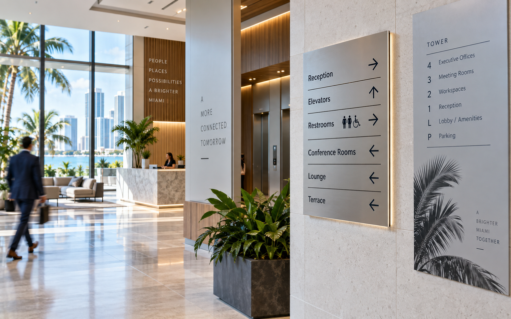
A visitor experiences a property as one continuous journey. Someone may first encounter outdoor signs near the street, follow parking instructions, enter a lobby, consult a tenant listing, take an elevator, and then follow an interior marker to the final room. When those touchpoints feel related, the experience becomes more intuitive.
Exterior information often needs to communicate faster because drivers have less time to read. Vehicular guidance should use short messages, strong contrast, and enough advance distance to allow a safe decision. Pedestrian information can sometimes include more detail because people move more slowly and view the message from a shorter distance.
In Miami’s climate, exterior durability deserves particular attention. Heat, strong sunlight, humidity, heavy rain, and coastal exposure can affect graphics, adhesives, finishes, and mounting methods. Material and production decisions should account for those conditions before fabrication begins rather than treating environmental exposure as an afterthought.
Where Should Signs Be Placed for Better Visibility?
Placement can determine whether an otherwise well-designed system succeeds or fails. A sign installed after the required turn is too late. Likewise, a panel hidden by a column, plant, door, display, or digital screen may be technically present but functionally useless.
Decision points deserve the most attention. Entrances, driveway splits, hallway intersections, elevator exits, stairways, garage lanes, and large open lobbies are common locations where users need reassurance. Sightlines should be evaluated from the perspective of the person approaching the decision, not only from the installer’s final position.
A useful exercise is to walk the property as if you had never seen it before. Start where a guest, customer, patient, tenant, or delivery driver would actually arrive. Every moment where you hesitate or ask “Which way now?” reveals a potential information gap that the visual plan should address.
How Does Wayfinding Change Across Offices, Retail, Healthcare, and Residential Properties?
Different properties create different movement patterns. An office environment may need to guide guests from parking to reception, elevators, conference rooms, suites, restrooms, and exits. A multi-level retail store may need to identify departments, escalators, fitting rooms, pickup points, checkout areas, and parking connections.
Hospital corridors can be more demanding because users may already be under stress and may be unfamiliar with the building. Unfamiliar campuses present similar challenges when visitors must choose between multiple buildings, parking zones, entrances, or walking routes. Clear hierarchy and consistent terminology become especially important in those settings.
A mixed-use development can combine residential, office, hospitality, retail, and service traffic within the same property. A housing development may need separate instructions for residents, guests, deliveries, contractors, and amenities. A shopping center may require broad orientation from the parking area followed by more detailed information closer to stores and services.
What Should Businesses in Doral and the Miami Area Consider?
Commercial environments can vary dramatically even within the same metropolitan region. Doral includes offices, warehouses, showrooms, logistics facilities, and large commercial sites where building identification and vehicle circulation can be central concerns. Denser districts may place greater emphasis on walking routes, high-rise tenant information, parking structures, and multiple entrances.
The south florida region also serves residents, tourists, international visitors, delivery teams, and employees with very different levels of familiarity with each property. Clear visual language, recognizable symbols, concise messages, and logical placement can help make complex environments easier to understand.
When people compare local sign companies, results may include franchise providers such as Signarama alongside independent production companies. Supplier comparisons can be useful, but the more important planning question is this: what information does the visitor need, where will it be needed, and how quickly must it be understood? Vendor selection does not replace a site-specific strategy.
How Do Accessibility, Safety, and Sign Planning Fit Together?
Accessibility should be considered during the planning stage. Depending on a sign’s purpose and location, applicable standards can affect character size, contrast, tactile information, Braille, pictograms, mounting position, and other details. Permanent identification and certain informational applications may require specific treatment, so those requirements should be identified before production.
Safety communication may also include emergency information, restricted-area notices, building identification, and required exit markers. These functions should be distinguished from promotional graphics even when the overall appearance is coordinated. Good signage design gives each category the clarity it needs rather than forcing every element into the same visual treatment.
A complete signage system begins with an audit of how people arrive and move. Primary destinations should receive the greatest emphasis, while secondary information can appear later in the journey. Orientation elements establish context, route cues guide movement, and identification confirms arrival. This layered approach is easier to follow than adding more and more signs whenever a problem appears.
Graphic Arts 305 can support properties that need custom fabrication, large-format graphics, rigid panels, wall graphics, floor graphics, dimensional elements, and other signage solutions for interior and exterior environments. The objective is not to fill a building with signs. It is to make each decision easier and create a clearer experience from arrival to destination.
Key Things to Remember
- Plan wayfinding as a connected visitor journey rather than a collection of unrelated signs.
- Place information before the point where a person needs to turn, choose, stop, or enter.
- Keep destination names, arrows, symbols, typography, and terminology consistent.
- Use identification, route guidance, and overview information for different stages of the journey.
- Select materials according to environment, durability, viewing distance, mounting method, and expected lifespan.
- Coordinate interior and exterior information so the experience feels continuous.
- Consider drivers and people on foot separately when their viewing conditions differ.
- Review accessibility and safety requirements during planning instead of after production.
- Test routes from the perspective of a first-time visitor.
- For custom wayfinding signs, Graphic Arts 305 can help create a coordinated visual solution built around the property, its users, and the customer experience.